
Website design and development
A website that gets people to the next step.
Make it clear what you offer, where you work and how to enquire. We design and repair the pages and interactions that help a visitor complete that task.

Answer the questions that come before an enquiry.
Imagine a kitchen fitter’s website. A homeowner needs to know which jobs the company takes, where it works and what to send for an estimate. A polished page can still leave all three questions unanswered.
Keep those answers together. A useful service page connects the work offered, a relevant example and a clearly explained enquiry step. The illustration shows how those parts fit together.
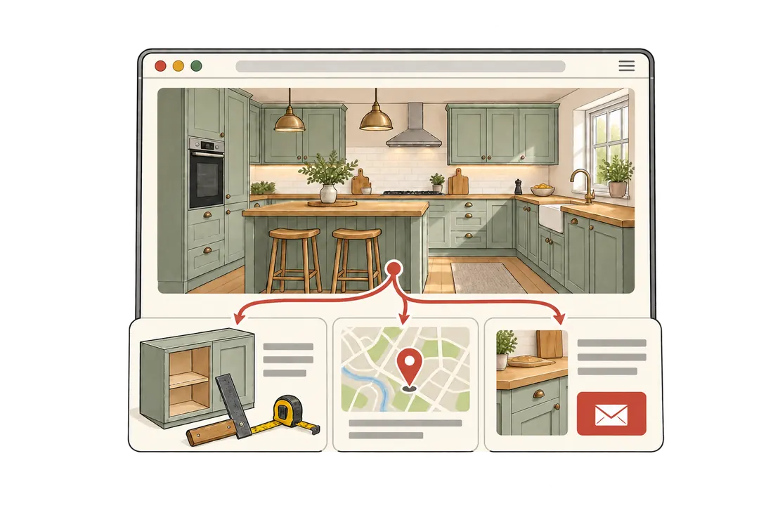
Give each part of the page a job.
Use the space to help someone decide whether the service fits. Start with details the visitor would otherwise have to ask for.
Name the work and the area.
“Kitchen fitting in Bristol” says more than “Quality solutions.” Explain which jobs are included and whether the visitor’s location is covered. Keep the service area easy to update.
Explain what an example shows.
A kitchen picture needs context: fitting new units is a different job from replacing doors. Use a short caption to explain the scope. Keep private details out, and identify illustrations as illustrations.
Make the next link specific.
“Ask about your kitchen project” gives the enquiry a purpose. Say what to send, such as location, a short description and useful photos, before the visitor opens the form or email.
A success message is only half the check.
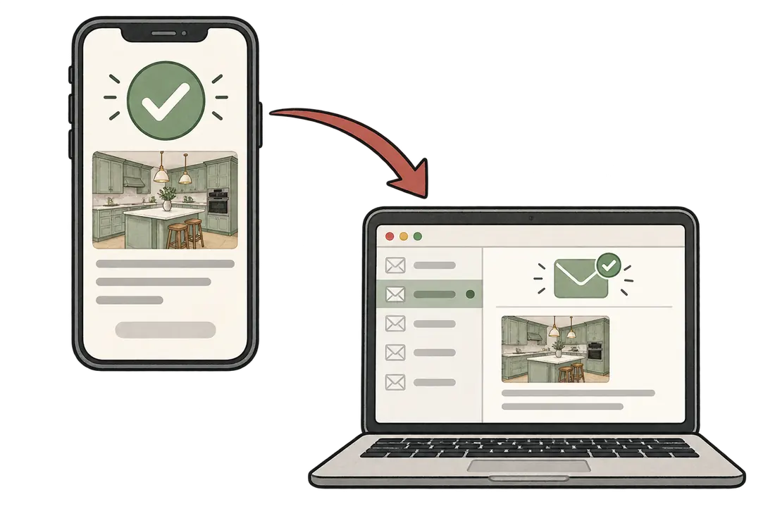
A form should label its fields clearly, ask only for useful information and explain how to fix an error. After submission, tell the visitor what happened. The W3C forms guide explains these basics.
Then check the receiving end. With the site owner’s agreement, send a clearly labelled test and confirm that it reaches the intended inbox. A confirmation on the screen does not by itself prove delivery.
Match the size of the change to the problem.
The missing answer determines the first move. A new visual style alone will not repair a broken enquiry or supply an absent service area.
A focused repair
If the route already works, a missing service area may need one sentence. An unclear next step may need a better link and a short explanation. Test that change against the original visitor task.
A wider redesign
If people cannot find the right service across several pages, or the layout obstructs basic tasks on a phone, the structure may need broader work. Agree the scope and the checks before building.
Whichever route fits, routine edits should stay manageable. The team should be able to update service details, examples and contact information without rebuilding the page.
Start with one page and one real task.
Give the work a testable purpose, from the first brief to the final check.
Send the page and the goal.
Include the intended visitor and action. For example: homeowners in the service area should be able to request a kitchen-fitting estimate.
Agree the useful change.
We follow that route, identify the obstruction and recommend a change with a clear scope. It may concern the wording, navigation, layout, loading or enquiry itself.
Repeat the task after the change.
Check the agreed route on desktop and phone, including keyboard navigation. Confirm that text is readable, images keep their place, the right detail is findable and any test enquiry reaches its destination.
Find the first change worth making.
Send the page, the customers you want to reach and what they should be able to do. We can help turn that goal into a clear website improvement.